A Guide to Healthcare UI/UX: Best Practices with Examples
5 years ago
The other day, we had a debate at our place about why healthcare app UI/UX is very crucial.
Every individual in the room had his own opinion.
But when I connected the dots, it all led me to the one conclusion that healthcare UI/UX is crucial to deliver not only a good user experience to users (patients and providers) but to help them achieve their clinical goals faster than ever!
How? Well, a poorly designed healthcare mobile app or software confuses the patients among its endless features which are meant to be used by users but users end up avoiding the entire product as they actually need to put efforts to satisfy their intent.
An intense clinical environment where healthcare IT products are used makes healthcare UI/UX more urgent than ever.
So, to not mess up with your healthcare IT product, here we are presenting the healthcare UI/UX guide along with healthcare UI/UX best practices or trends.
Let’s start with the basics.
What is UI/UX in healthcare?
Let me try to explain it with a most popular meme of the UI/UX industry.

Here, both ketchup bottles are UI.
They are interfaces. Users will engage in and interact with it.
Both ketchup bottles are UX too.
The left one seems frustrating to work with due to its narrow and poor design. While the right one seems better in terms of design and offers a more enjoyable experience to users.
Meaning, UI is what users see. And UX is how users feel while engaging and interacting with the UI!
UI is made out of icons, navigation, different design elements, buttons, boxes etc.
Whereas, UX is how each of these UI elements makes users feel while using the healthcare IT product.
Why is healthcare UI/UX different from other industries?
Regardless of industries, every mobile app, web app and software has UI/UX. However, the UI/UX of different industries follows different standards and best practices.
For instance, the UI/UX of an eCommerce app like Amazon is very different from the UI/UX of a taxi booking app like Uber.
This difference is clearly visible in how these two different apps of different industries decide the theme, showcase the products/services, use the font, navigation, animation etc.
But the question is, why aren't there any uniform UI/UX standards across all industries?
The question lies under the users and their intents each digital product is targeting.
In the case of Uber, people aren’t interested in reading long text as their intent is limited to book the ride, track the ride and make the payment which can easily be represented in graphical format.
Whereas, in the case of Amazon, people are interested in knowing product descriptions, user reviews, return policies that need to be presented in the text only.
Talking about healthcare, user intents are totally different. A user is using a healthcare app for a very personal reason which links to his health and wellness.
So to let users satisfy such crucial intents, we have to define new UI/UX best practices specifically for the healthcare industry.
If we fail to let users satisfy their intents which are by the way not similar to other industries, they have to suffer loss related to their health and wellness which they would never accept!
This is why designing a healthcare app is very different from designing an app that belongs to any other industry!
How does healthcare app UI/UX solve healthcare challenges?
Let us share a scenario where we will discuss how a healthcare challenge can be solved with UI/UX.
Nurses and other clinicians are constantly multitasking in senior care settings. They manage all information from paper, email, phone call, fax, verbal communication, voice record and computer.
Where they are struggling most is medication management as it requires the highest level of collaboration between pharmacists, nurses and physicians.
Unfortunately, medication waste and errors can occur in all stages of the senior care lifecycle.
One of the major reasons behind medication errors is paper-based processes. And even if they use digital solutions, physicians write prescriptions on paper and leave it on nurses’ shoulders to digitize medication orders.
Moving this workflow to the cloud is the best solution here. The outcome would be easy tracking of all medication orders from physicians that free ups time for nurses and dramatically improve accuracy and efficiency.
To build such a solution, we first need to create its UI/UX which makes a good impact on the lives of caregivers.
A good UI/UX also makes sure that caregivers can carry out their senior care tasks online very seamlessly and provide them with a platform to easily collaborate with other clinicians that ultimately enhances the patient outcome.
You must also read: How to hire healthcare UI/UX designers?
Why it's impossible to build a successful healthcare product without custom UI/UX?
You might be planning to skip the UI/UX part or utilize some ready-to-use UI/UX for your healthcare project.
If you're planning for such, let us tell you the two reasons why it's impossible to build a successful healthcare product without investing at least 300 hours on designing custom UI/UX.
Reason #1: UI/UX = experience and experience != same
Your UI/UX is the digital experience you provide to your users and it is obvious that you must always deliver a unique experience to your users. If it is identical to some other platform, you won't be able to deliver any value to the users. Because someone is already delivering what you are delivering. So, this is why, to deliver a unique experience, you must design custom UI/UX.
Reason #2: Developers can't code without UI!
Try this thing. Ask developers to code a screen of the telemedicine platform but don't provide them with any design. They will surely see you with narrowed eyes! Because developers always require the design of each app/software screen to code accordingly.
Top healthcare UI/UX best practices that assure best UI/UX for your healthcare IT solution
These are the trusted and tested practices as our in-house healthcare designers have been following these practices for almost all healthcare app design work.
- Graphics makes tracking easy
There is a lot of data in healthcare which patients and providers need to track to monitor and to evaluate the healthcare progress or patient outcome.
You must present this data in a graphical format to make it easy for users to understand.
- Prioritize what matters most to users
A healthcare digital solution is equipped with several features. But not all features are as useful to users as a few features are. You need to identify those few features and showcase them in a large, visible and clear way.
- UI should be inspiring!
See the following example. The designer has smartly embedded images of random people having a fit body to inspire users to achieve the same by utilizing the app.
- Round-edged elements look elegant!
Round-edged elements in UI are so game-changing that even Apple and Google have used them largely in their OS design.
- Divide a major user task into different sub-tasks
Don’t aim to make users achieve a task in a single app screen. Instead, divide a single task into different screens. That actually users find easy.
See the below example to understand how the designer has divided an appointment booking task into 3 different screens.
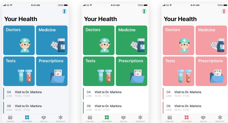
- Choose theme colour based on app/web type
Colours are the first thing users notice. To engage users, it is crucial to match the app colour with the healthcare app type.
But in general, blue is the most used colour in healthcare app themes as the blue colour represents calmness, peace and good health.
More specifically, you can use the green theme for diet-related apps, the pink theme for women wellness apps and the red theme for medication-related apps.
- Keep text large and clear
Don’t use stylish fonts. A simple font looks more clear and pleasant. See the following UI example in which every text is clearly readable.
- Don’t clog it up!
A clogged-up app screen not only irritates the user to find the thing he is looking for but also gives him the reason to close the app.
See the difference between the following two app screens and decide by yourself!
Or,
In search of top local healthcare app developers and healthcare app designers?
We’re an Ontario-based healthcare-focused IT company - helping healthcare providers, enterprises and startups achieve best-in-class healthcare products for 7 years.
We accommodate healthcare app developers, designers, business analysts and even compliance experts who have only been building and designing healthcare IT solutions.
Imagine how good you would become at a task if you had been doing the same task for years!
We only serve the healthcare industry. Yes, it restricts our revenue possibilities. But we care more about gaining industry-specific knowledge and help our healthcare clients like no other company in the world could help!
Overall, we provide clinical value and peace of mind. Both are rare to find!