How Can Medeo Further Enhance the UI/UX of its App? – An Opinion With Examples
5 years ago
Telemedicine - as we all know - is the most powerful healthcare technology.
It emerged a way before the pandemic, but the pandemic fueled it to the extreme level.
And now, everyone prefers televisits with physicians rather than visiting the nearby clinic.
Telemedicine apps enable both patients and physicians to talk virtually and remotely.
Medeo is one such app. In fact, it is the 6th most popular medical app in Canada - according to Similarweb.

The Medeo app has a great UI. But still, as they say, there is always scope for improvement.
Our UI/UX team has extensively analyzed the UI/UX of the Medeo app and found out how they can further improve the user experience with the improved UI.
(Please Note: We are in no way affiliated with Medeo. We are a Canadian telemedicine app development company that finds the Medeo app very interesting and eager to share our opinion on what they can do next in terms of UI/UX.)
The Problem (with all telemedicine apps)
Telemedicine apps are convenient, fast and useful.
But a few designers are killing its usefulness and convenience by either over-engineering the design or keeping it too simple.
It seems they don’t consider the target audience while designing the telemedicine app. Or, they might be using the readymade telemedicine design template.
Anyway, the real challenge with the telemedicine app UI is that it is too complex for its top user group which is patients.
Patients (users) use the telemedicine app when they are unwell. At this time, they aren't concerned about the complex or advanced features of the app.
They only want direct care by making the minimum number of clicks and not reading the long content before clicks.
In other words, their user journey should be very short.
Sign in - describe healthcare issue - wait for a few seconds till the app algorithm finds the physician for you - have televisit!
But with almost every telemedicine app, users need to spend a minimum of 2-3 minutes just completing formalities before an actual virtual visit with the physician.
Sign in - complete profile - select insurance - search for a physician - ask for an appointment date/time - confirm the appointment - have televisit!
This long user journey indeed irritates the users who are already ill or irritated due to poor health!
Users, Their Goals and Frustrations with All Telemedicine Apps
A good app design is always based on user persona!
User Group #1: Users with Minor Discomfort with Health
Such as headache, cough, fever or gastric issues
Goals:
- Televisits after working hours
- Instant televisits without prior appointment booking
- Televisit length should be under 10 min
- Not always require a video visit. Chat can work for them!
Frustrations:
- Users always need to book a prior appointment.
- The video visit is set by default. (Users don’t have the option to select chat preference)
- Users don’t have the option to select the preferred televisit length.
User Group #2: Users with Chronic Diseases
Such as heart diseases, cancer, lung diseases, stroke, diabetes etc.
Goals:
- More frequent televisits
- Instant and easy follow up visits
- Televisits with the same care provider
Frustrations:
- For every visit, they need to book a prior appointment.
- From the televisits history, they cannot instantly book follow-up meetings.
- Users cannot book televisits with the same care provider.
User Group #3: Users with Personal Health Issues
Such as urinary tract infections, birth control, erectile dysfunction and mental health-related issues.
Goal:
- A more ‘private’ televisit
Frustration:
- Users do not have an option to select only the chat option without disclosing their identity.
Redesigning Medeo App’s UI with New Design Philosophy
It is clear that a telemedicine app UI needs to be simple with only useful features and the UI should not irritate the users by lengthening their user journey.
The Medeo app works on these principles only. However, a good designer can further enhance the UI which takes user experience to the next level.
Here is what our design team suggests:
(But before we proceed further, please note Medeo app UI is the inspiration for many designers. They must have considered all factors while designing the app. The following is just our opinion on what Medeo can do next.)
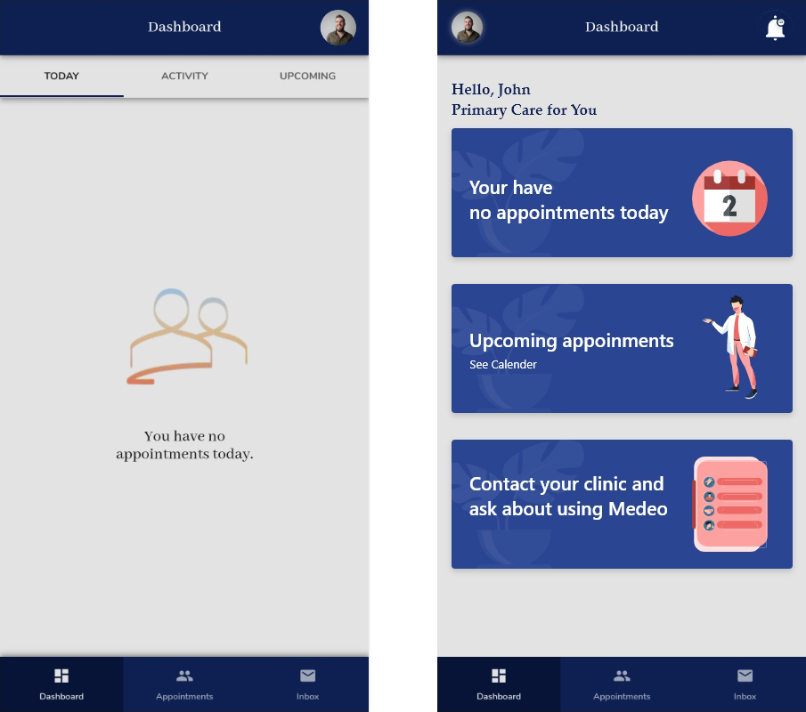
1) A Personalized Onboarding Experience With Home Screen
If you face challenges while boarding a flight, your whole travel experience gets ruined automatically.
Same way, if a user experiences an unpleasant onboarding experience on the app, he does not feel confident throughout the user journey.
One way to enhance the app onboarding experience is a personalized home screen as users spend the most time here after spending a few seconds on a sign-in page.
Medeo virtual care app has a very clean home screen with no extra information.
But it somewhere does not provide a personalized experience to the users as the home screen looks too empty especially when users have no booked appointments.
The home screen does not also greet users by their name.
(Greeting people by name is one of the most basic and influential social skills strategies which apply to the digital world too!)
Additionally, it would be a great UI strategy if there is a calendar view to know all upcoming appointments.
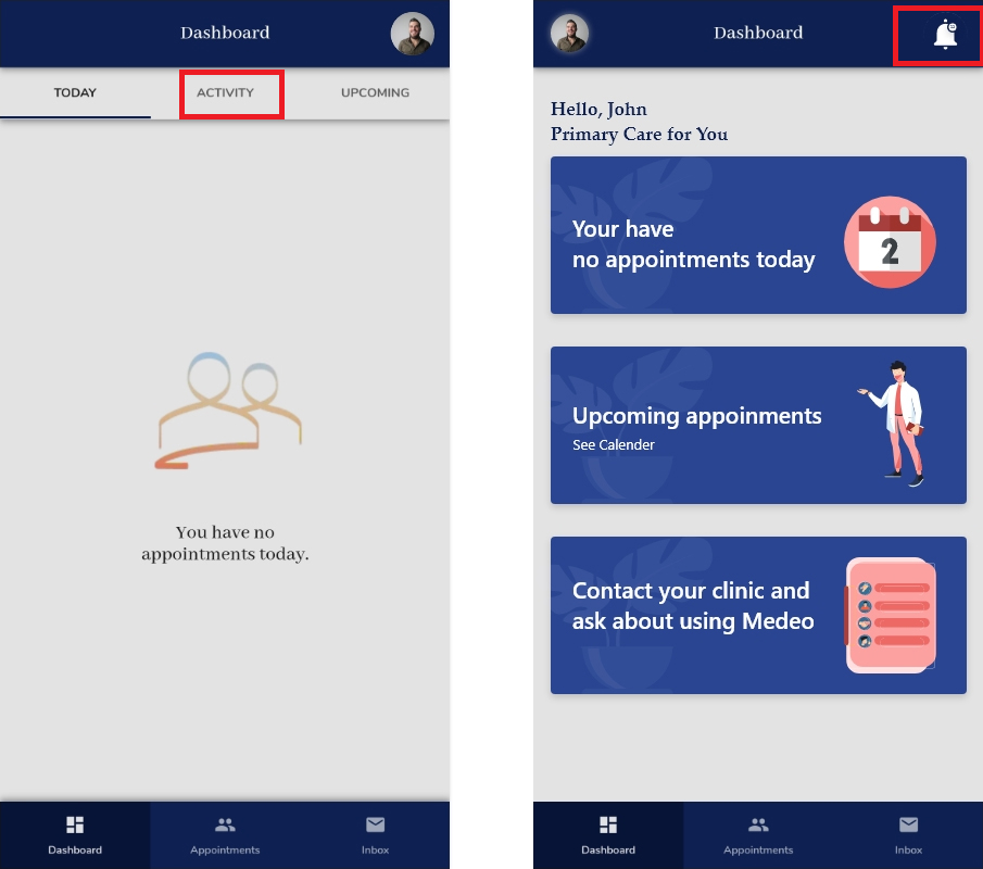
2) Notifications
Notifications allow app owners (here physicians) to keep in touch with patients by providing timely messages and useful information.
The location to put the notification button should be decided strategically as it influences the engagement rate of the users.
The one best practice is to have it on every important mobile app window.
In the case of the Medeo app, there is no notification button.
Instead, they are using the ‘activity’ option which is a great option but it is only accessible from the dashboard window only.
A strategically planned notification button is the typical notification button with a bell icon and placed on the top of windows.
(Because that’s what people are used to - thanks to top social media apps!)
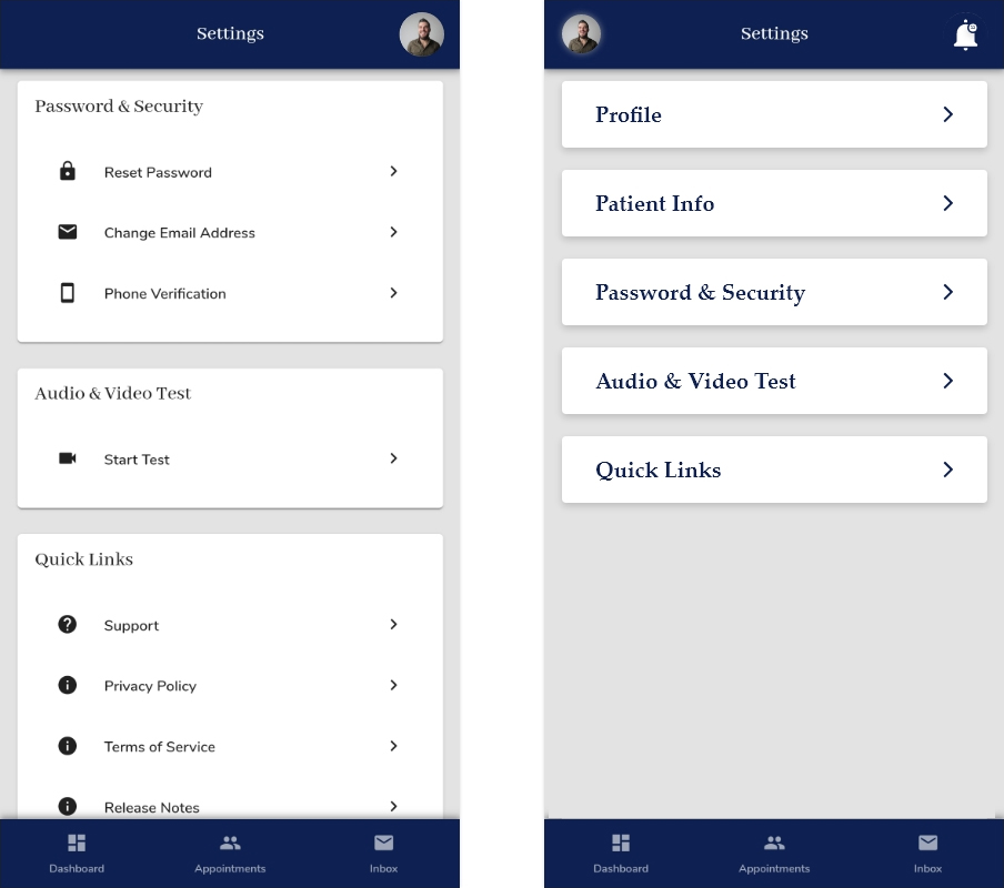
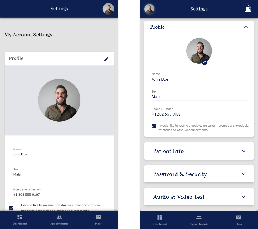
3) A Very Lengthy Setting Screen
Medeo app offers a great number of options to update profile, password, security and even test audio and video.
However, they have fitted all of these options into one screen because having multiple screens to fit all setting information is not a good idea at all.
But the challenge is always the same, how would you fit all important details into one screen only.
Here is how:
Or,
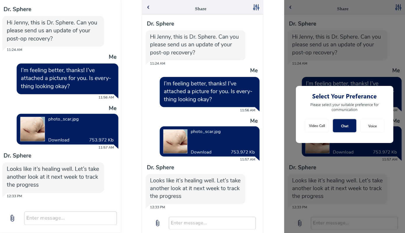
4) Communication Preferences
As discussed, the major frustration telemedicine users are having is their lack of ability to select whether they prefer a video visit or just a chat with a physician.
Providing such ability to users improves their convenience as not all users prefer a video visit.
A Message to Everyone Looking for a Telemedicine App Design Template
Telemedicine app design templates are the myth.
None of the top telemedicine platforms including Medeo have used readymade UI design.
Because UI is the most important element of the app and it should be designed from scratch after studying the user goals and frustrations.
(To make entrepreneurs aware of this fact was the only purpose of this blog!)
In case you’re struggling with telemedicine app UI, hire our dedicated designers or get the complete telemedicine app ‘package’ starting from $20K which include,
- App UI
- App for physicians
- App for patients
- Compliance support
- Custom onboarding
- Post-app-launch support